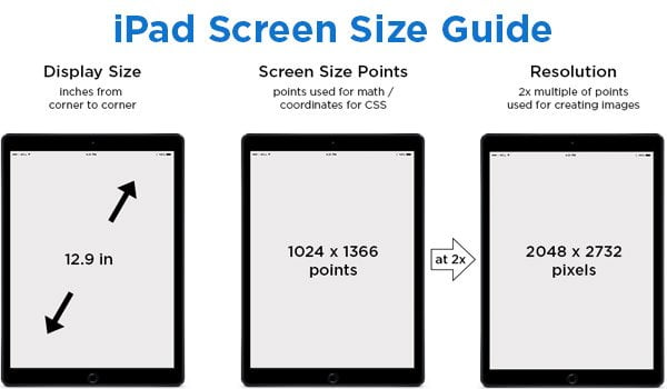
When taking on Responsive Web Design (RWD) and looking to cater for screens of all different shapes and sizes, I think it is largely lost on the consumers that screen resolution does not equal how big a website can be and will appear (and look good) on their mobile device.
Whether it be tablets / iPads, smart phones / iPhones, there seems to be a misconception that whatever the resolution the device lists on its specifications page, that should match the dimensions that the website should take on. Or more to the point, should be able to take on.
But this assumption is incorrect and with good reason – if a website strictly followed the resolution of a device (such as an iPad with Retina support) then it would look teenie tiny (technical term). The question then is, what is the difference between viewport and resolution when it comes to displaying web pages and taking on responsive web design projects?
Screen resolution vs viewport
Where the confusion seems to lie (and I partly blame the manufacturers for this) is twofold:
- the resolution as listed by the manufacturer
- understanding DPI (dots per inch) or PPI (pixels per inch) and how it effects each device, especially when the physical size of the unit is the same as those with lower resolutions
The resultant viewport (actual display area of the device that you are holding in your hand) is generally therefore much smaller than what you might first think, if just taking resolution into consideration.
The iPad example
Looking at a popular tablet example, the Apple iPad, the resolution of the device has increased dramatically since it first came to market, with the 1st generation and iPad 2 boasting a resolution of 1024w x 768h (when held in landscape mode). Since the iPad 3 and the introduction of the Retina display, the resolution has increased to 2048w x 1536h and yet, importantly, the physical screen size has not changed. The viewport on a first generation iPad is therefore exactly the same as that on iPad 4, or iPad Air.

Rather than increase the physical screen size, Apple figured out a way to cram more pixels into the space they already had, meaning the iPad 1/2 has 132dpi (or ppi – pixels per inch) and when the iPad 3 was launched, 264dpi.
Other manufacturers were quick to follow suit. The problem I find is that the viewport is not something usually found when looking at the specifications of a particular device.
Working with viewports
With the plethora of devices out there these days, with all different screen sizes and progressively greater resolutions, as a web developer it is getting increasingly more challenging to build websites that take on a responsive design, and still look as intended across the many tablets and phones available.
Knowing the viewport of these devices is key to this challenge, and then building my media queries appropriately. I should mention here also that I do not try to target every specific device when it comes to media queries, and instead look to have several suitable “blocks” that cater well for a greater range of devices (keeping images out of the equation here for the moment).
Having said all that, I still needed to know the viewport of the devices so I knew better where to put my “break points”. And to that end, I recently found a very handy website that helped me with that:
A site simply called Viewport Sizes
This site has a great list of devices (and are also quite regularly updated), and also has a very handy filter option.
If you can’t find the device you are after in the list though, a handy sub-page on Viewport Sizes is called Viewport Sizes Mine, which will tell you the viewport settings on whatever device you open the link in. It works if you resize your browser, and also works if you scale up/down your browser zoom. Nifty!


That website hasn’t been updated in a while. If anyone wants a more updated list of device viewports (including CSS widths and PPI) then take a look at https://viewportsizer.com/devices/
Thanks for the update Jason!
Your links are all dead…
Hi Donna, thanks for the heads up! Now resolved
I found this article to be very enlightening and educative. Thanks a lot.
Thanks for this info. I noticed it but I had to confirm and read it from someone else.
No problem Alberto, I’m glad you found it helpful!
thanks, really helpful!
Thanks Antonio, I’m glad you found it so!
At last someone explaining it in a simple way! Thanks a lot
You are very welcome Rakshay!