FooGallery not opening custom URL, resolved

Recently I wanted to add a small, yet nice looking gallery of work to my site, specifically to my About page. Although I do use and advocate for Elementor as a product (especially for non coders) I didn’t much like the galleries on offer there, and I am generally not one to use “non Elementor created” add-ons.

I decided to go with FooGallery as I like the typical style it uses and had used it years previously, with good results.

Adding the gallery itself is a breeze, and I was organised enough to have all of my images sized to what I liked, so creating a carousel with a half dozen or so images of websites I had either created, or designed and created, didn’t take too long at all. Thinking it would be good to also have a link to the website, I carefully added custom URLs to each of the images in the gallery.

Check the Gallery Settings, Thumbnail Link

I am using the Carousel style gallery, so one thing to check here is that the Thumbnail Link setting (at the bottom of the General settings of the Gallery) is set to “Custom URL”.

Picture of FooGallery Carousel Mode Gallery Settings

I figured once done, I could save the gallery, view it on the live page, and people could click through to the real deal. WHAT A FOOL I WAS!!

Check the Lightbox Settings

With the above set, you also need to check the Lightbox settings on the Gallery itself (not the general Foobox settings) and set this to something other than the default; set it to FooBox.

This solution was found largely thanks to a WordPress support topic, found here, but part of me wanted to write this blog about it if for nothing other than to remind myself this issue existed!

Once then saved and page loaded, the custom URL was working as expected.

I hope you found this helpful! If so, please share with your socials, or let me know if you run into any issues in the comments section.

OneDrive Users Continue to be Frustrated by Shared Folder Bug

OneDrive shared folder added to My Files

A shared folder in OneDrive now acts like a browser shortcut (for some users)

It came to my attention a few weeks ago (mid June 2024), from a customer of mine, that they were having an issue with a OneDrive shared folder. The customer is using Microsoft 365 Family. This is despite following the instructions to have the folder(s) that are “shared with me” added as a shortcut to the local OneDrive folder.

OneDrive shared folder added to My Files

The problem is that with one member within the Microsoft 365 Family, the folder no longer acted like a regular local folder via File Explorer. Instead, the folder looked like a shortcut (little blue arrow bottom left corner) and when clicked on would open the online/Browser version of OneDrive. Other family members are not affected (yet) and the issue appears to affect both Windows and Mac users, and is not necessarily tied specifically to the version of OneDrive. Meaning, all computers are using the same version of OneDrive (Build 24.126.0623.0001, 64-bit), yet just one family member cannot see the folder shortcut as they normally would.

This remains a cause of frustration for the customer (now into July 2024), due largely to a loss of productivity and apparent apathy from Microsoft. I have seen it stated that a support response has been along the lines of, “well you can edit the document in the browser version of OneDrive”. This only works if the file has a browser based editor though, as otherwise the user must download the file, edit it locally, and re-upload, all while hoping someone else isn’t doing the same thing. Not good enough, Microsoft.

Anecdotally it may only affect Personal and Family users, and not Office 365 Business users. This merely flames the conspiracy fire as people look to explain as, “Micro$oft forcing people onto higher paying plans and prevent very small business from using 365 Family”.

Whilst it seems Microsoft do acknowledge the issue, at time of writing there has been little information by way of updates on progress or any indication as to when a fixed version will be available (or really, what users would need to do, if anything, once a fix is released).

More can be seen about it in several Microsoft support forums, or Reddit posts. No doubt found elsewhere as well, as people start to turn to alternative solutions such as Dropbox and Google Drive.

My own testing

I think the issue somehow lies with the OneDrive account.

I have come to this conclusion after trying numerous things to fix the issue on one laptop, which included:
removing the shared folder from the problematic computer, and re-adding it
removing OneDrive completely and reinstalling it
Taking the access away from the laptop user, removing the folder from the laptop, and re-applying everything
Performing a fresh install of Windows on the problem laptop

None of the above worked.

Really I should have tried the following before doing the Windows reinstall (purely to save time):
I logged into the problem laptop as a different family member, one that was not having the issue. It worked! The OneDrive shared folder was behaving as it should.

Out of curiosity I then logged into my own laptop as the “problem” user, and I could now reproduce the issue locally.

I decided then to share the problem folder with my own Microsoft account, logged back into my laptop as “me”, and OneDrive was back to normal and the shared folder was behaving as expected.

My loose workaround

From this, I concluded that the issue actually lies with the account associated with OneDrive, and not strictly the operating system or version of OneDrive.

Theoretically therefore, if I could share the folder again with a new account, then maybe the issue would go away (if albeit temporarily).

This worked! A bit of a hassle as I wanted to make sure the new account had enough OneDrive space and therefore added into the Family (luckily had spare licenses) and there isn’t much else this user needs to do within OneDrive other than access this one shared folder, but it worked and now the problem laptop is logged into OneDrive (and OneDrive only) as the new account.

Now that I’m typing this out, the Microsoft 365 Family license might not need to be used, so I’ll see if this can be done away with.

The key to it all though (as I see it) was to have the new account created, and the OneDrive folder shared with them. Perhaps this method will help someone else? I’d love to hear if it did or if you have another workaround!

Please share in your social network if you found this helpful.


Having Blog in your Post URL without affecting Custom Post Types

Is it possible to include “blog” in the Post URL?

I was working on a project where I was transferring to a different CMS (WordPress), and the original blogs all had “blog” in the URL. I wanted the same format in the new site, figuring this was the best thing to do for existing SEO.

However, the new WordPress site is also using Custom Post Types (CPTs) and I didn’t want to affect the URLs of those posts. My instinct was to change the Permalink Settings to add “/blog” to the front, but this also affected the CPT URL.

example of Permalink Structure with blog at the front

Checking with my good friend Google seemed to take me longer to find the solution than expected, and admittedly I may be just stupid, but I thought I’d write this to see if it helps anyone else in the same, or similar, situation.

Why not use a Custom Post Type plugin to handle this?

It is highly likely that a decent Custom Post Type plugin would be able to handle this “out of the box”, however I had already created the post type somewhat manually, using what I think is a very nifty little plugin called WPCode which typically means for me less plugins installed overall (seriously, check it out, it’s great).

Ultimately it meant I had basically entered the CPT code manually, but obviously had something missing that might allow me to “strip” or ideally “ignore” this starting part of the URL structure.

Links high up the Google SERP had me looking at various Custom Post Type plugin solutions, or more like stripping it after the post was published or upon retrieval which seems like a slow way of doing things (or if not slow, less efficient), meaning doing something via the functions.php file.

Finding what I thought was going to be my answer, as it at least spoke about the Post Type registering process, only gave me half the answer and contained my bug bear (one of many) of typically developers (yes I am looking at mostly ALL of you developers out there!) that tend to post incomplete code snippets under the assumption that I am smart enough to figure out the rest. Well I am NOT, dammit!

My answer with a more or less complete code snippet

My Custom Post Type is Projects. I want the URL / slug to appear as “project”, so something in the line of https://mysite.com/project/project-post-title.

So in my arguments array, the start of which looks like below:

// Set other options for Custom Post Type
      
    $args = array(
        'label'               => __( 'Projects', 'responsive-mobile-child' ),

I had the following right at the end or the array:

'rewrite' => array( 'slug' => 'project'), // my custom slug

    );

Which worked perfectly fine until I changed the Permalink structure as per above, which meant I now had https://mysite.com/blog/project/project-post-title.

Not cool, and probably not ideal for SEO considering the original “projects” had the more desirable URL.

All I had to do though was slightly edit that rewrite line, so it now included ‘with_front’ => False and now it looks like this:

'rewrite' => array( 'slug' => 'project', 'with_front' => False), // my custom slug
);

Saving the Permalink again at this point seems a good idea, so after doing that my “Projects” all had the appropriate URL (with just “projects” in the URL) and my regular posts have “blog” in the URL.

Huzzah!

Hope this has helped someone, and if any more explanation, or code snippets, are required then feel free to get in touch. And don’t forget to share!

How to avoid online scams

Scammers online are rife these days, with Australian victims perceived to be rather soft targets.

Gone are the days where we might be duped by Nigerian Princes or very poorly written emails from, apparently, Margot Robbie (yes, I got one of these once). Instead, scammers often rely on your goodwill or perhaps a moment of vulnerability to trick you into thinking you need their help to avoid “unnecessary and unwanted charges”, and before you know it they are accessing your computer and perhaps your bank accounts.

So how do you spot these from the real deal?

Read on for some tips on how to avoid being scammed.

How is this service contacting me?

With the abundance of choice of streaming services or similar, comes a vast choice of ways for scammers to grab your attention.

popular streaming servicesWhether it’s a big bank, Netflix, Disney+, Amazon, the ATO, Telstra, or something else, scammers will throw any well known service out there, casting the net as wide as possible, and see what lands. This sort of scamming can be described as phishing, as the scammers are trying to land any fish. That’s you, you’re the fish. Don’t be the fish.

The way this works is you receive an email, text message or phone call out of the blue that appears to come from a bank, or a service you might use (eg. Netflix) that either tells you that your credit card details are out of date and need updating, or that you have just been successfully charged and if you no longer want to be charged, click THIS button!

These emails are often alarmist in nature (YOUR SERVICE IS ABOUT TO BE CANCELLED!), often require you to do something quickly (ACT NOW!), and/or trying to trick you into thinking you have been charged something when you haven’t (THANK YOU FOR THE PAYMENT OF $70 IF THIS IS IN ERROR CLICK HERE OR CALL THIS NUMBER!), for the purpose of you making a rash decision and calling the number, or clicking the bright shiny button.

Clicking the button within these emails might do one of several things:

  • Take you to a fake, sometimes well branded (sometimes not), website for you to enter card details
  • Convince you to make a phone call to the number provided to talk about your “refund”, and thereby hand over card or banking details
  • Perhaps ultimately convince you to download some sort of remote access software to “help” you with the refund
  • Something else that is just as dangerous

All of this spells major trouble, and the downloading of remote access software (eg. AnyDesk, AnyPlace Control, Ultra Viewer) fills me with the most dread.

Some personal experiences

how to avoid scammers onlineIn the last month I have had no less than 3 customers contact me due to activities based on the above. All of them had a similar story to tell, they were all a little embarrassed about what had happened, were a little vulnerable at the time due to a hectic life or less than ideal personal circumstances, and had unwittingly allowed access to their machine and in some cases, bank accounts.

One person hadn’t lost anything and realised what was going on, and quickly shut it down.

Another lost a few hundred dollars, but was apparently getting it back from the bank after discussing the situation with them. In this instance, it was bills that appeared to come from Google that the victim had paid, and having an online business was quite used to receiving such bills.

Another had someone in their accounts and setting up payments to a third party before they realised what was going on. Last I heard, they were trying to talk to the bank about getting over $9,000 back …

Another common scam is to say that you have been charged a relatively small amount of money. For the sake of an example, let’s say $50.00 and now you are looking for a refund because you never signed up for this service to begin with, so how dare they take your $50 to begin with, right? Helpful Company (the scammer) says they have refunded you, but OH NO they have made a mistake and refunded you $500.00. Now if you can just be kind enough to refund that money back to the account number they’ll provide (“you might not see the $500 in your account yet, because you know it clears overnight”), because if you don’t they’ll get fired and then who will feed their 5 children … you get the idea but in this way they are trying to prey on your goodwill and sense of doing the right thing. Now just download this Remote Access software and Helpful Company will walk you through it!

Things to look out for

Poorly spelled email subjects, or content. Dead giveaway, though less and less common. However, legit company emails are good at getting the spelling perfect. Also look for impersonal emails (Dear Customer, versus your real name).

Do you even use the service? I got an email recently that I admit looked great. Content was solid, good use of logos and other imagery. Only a slight typo in the subject which I didn’t actually notice on the first read. If I actually had a Paramount+ account, I might have even believed that I was about to be cut off!

Buttons, links, click-throughs that go somewhere completely different to the expectation. A lot of email viewers these days will show you where the email has come from (return email address) or where the link is going to, when you hover on it. Try this, and see what it says. The email that I received recently telling me that my Disney+ account currently has “suspension your account” I doubt should really be using imagery or links from “lumiere-a.akamaihd.net”. That all of the footer information was in Spanish is quite the red flag also.

ANY text message or SMS that wants you to click a link. This is popular with bank and tax/ATO scams. If in doubt, don’t believe them, and contact your bank or service via another means (look up the phone number in a separate Google search). The real service providers don’t want to lose your business, and won’t simply cut you off. Just TRY and genuinely disconnect from Foxtel to see how difficult it is!

No service wants to be paid via Apple iTunes cards (a still popular ATO scam).

Nobody is going to buy your car sight unseen via a friend/agent that only wants to pay via PayPal and pick it up to deliver to Far North QLD or the NT.

If you have been told that an amount from a service you don’t use has been successfully charged, check your bank accounts to verify it is true. And don’t click the button.

The last word

It only takes a couple of bites, a small number of people to take the hook, for the scammers to make a good amount of money. This is a large part of why such scams continue to be seen.

By being ever vigilant and perhaps even a little suspicious of any email asking you to click a link or button to avoid cancellation of a service (or to commence a refund process) you can help keep yourself and your money safe.

Please don’t ever, EVER, allow someone you don’t know and trust to install any sort of remote access software on your computer.

And don’t click the shiny button.
How to remove the text “Published On:” in Avada custom archive page

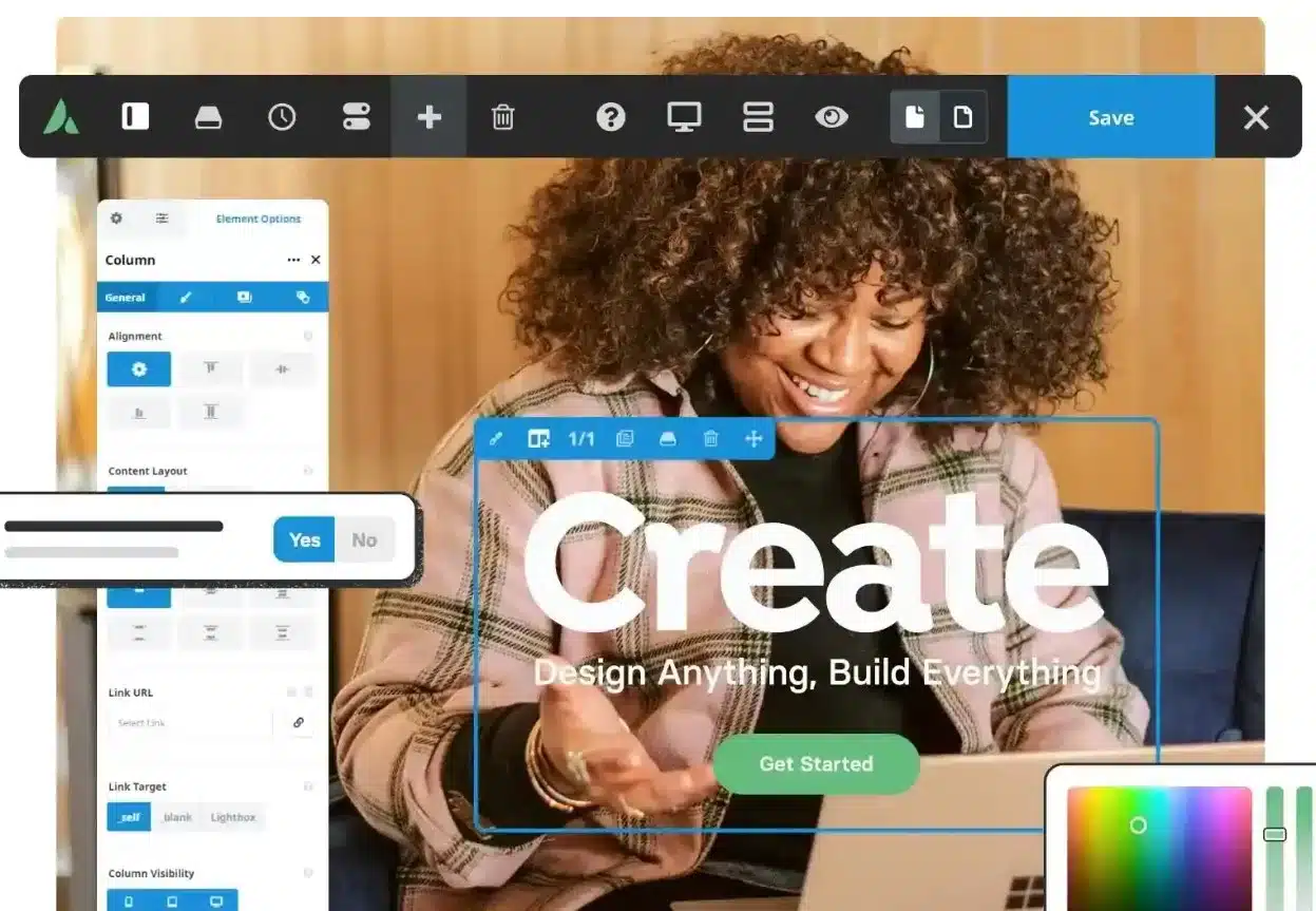
Avada theme screenshot

Recently I created a custom Blog and Blog Archive page for a site using the Avada theme, and this brought my first experience with Fusion Builder. 

This in itself was a reasonably smooth process, once I watched a tutorial or two on how to best delineate between header, content, and footer.

Whilst I got the Blog page working the way I wanted it, I noticed on the Blog Archive page that, within the meta information, some extra strings were being presented such as showing “Published On:” before the published date, and “Categories:” before the list of categories. These don’t show on the standard Blog page, and it seemed more tied to the Post Card Blog Archive element I was using.

I couldn’t find any way within Avada options (nor element options) to control this, or change the labelling.

Thanks to this Stack Overflow question, I was able to find more generally where the issue was coming from but then had to dive a little deeper to find out the exact file in question, as it wasn’t mentioned in any of the answers.

Part of the issue is that the above mentioned strings all form part of a single span, meaning that the “Published On:” string was immediately followed by the actual published date, and contained within a single span. This meant a CSS solution alone was not going to work.

So, for those that might have followed the same path and looking for something a little more specific, I can tell you that the way I fixed it was to find the Fusion Builder plugin (fusion-builder), then the “shortcodees” folder, “components” folder, meta.php file.

Doing a search for “Published On:” within this file showed this:

case 'published_date':
	/* Translators: %s: Date. */
	$content .= '<span class="fusion-tb-published-date">' . sprintf( esc_html__( 'Published On: %s', 'fusion-builder' ), get_the_time( $date_format ) ) . '</span>' . $separator;
	break;<br />

I kept the “%s” component so that the code now read as this (recommended to make a copy of the original file before editing):

case 'published_date':
	/* Translators: %s: Date. */
	$content .= '<span class="fusion-tb-published-date">' . sprintf( esc_html__( '%s', 'fusion-builder' ), get_the_time( $date_format ) ) . '</span>' . $separator;
	break;

Rinse and repeat for “Categories:” and any other meta label you might want to remove. Save the file, and upload it to the server, refresh the page and got the result I wanted.

The downside of this method is that the changes will need to be made again if and when the Avada theme is updated, but to date I have not found another way to handle this situation.

In the meantime, I hope this information has helped you!

Unable to purchase Robux via App Store for my child’s Roblox

roblox characters

As the father of a child under the age of 13, I am often tasked with giving permission for her to purchase / install apps on her iPad, including purchases of Robux for her rather popular Roblox app. Sometimes though the permissions don’t seem to work, and I either don’t get the notification at all, or trying to act on it doesn’t work as expected. Here’s how we fixed it.

Despite her best intentions, such as saving her pocket money and literally giving me the money to pay for her desired Robux purchases, something screwy seems to go wrong with the whole Parental Controls thing when it comes to the Apple app store.

She would request the Robux purchase. The app would tell her she needs to ask permission. She’d do that. I’d get the notification. I’d try to open the notification (which for some weird reason has started opening in Apple Messages). I’d click View in Store. I’d get a message on screen, “Cannot Connect to App Store”.

What we tried

Restarting both iPads; shutting them down and cold booting them up again (not just a restart).

Making sure both iPads had the most up to date versions of iOS.

Making sure she had the most up to date version of the app. To be fair, these first two or three things have normally fixed things for us in the past. Not this time.

Googling a lot.

In some desperation, even going to Bing.

Yelling a lot.

How we fixed it

Need to give the credit to my 11 year old here.

Her idea was to install Roblox on my iPad, and then log into it using her account. We then made the purchase of Robux and because it went via my natural Apple App Store, no permission was required (which is good because my parents would have said no).

Back onto her iPad, and restarted Roblox, logged in, and voila! Robux purchase was there!

I could then remove Roblox from my iPad. This kind of work around / fix might work for other apps too, so long as you have another Apple device that can be used to install the app on. If this has helped you, please let me know in the comments!

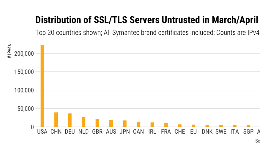
Distrusted SSL certificates not reflected in Chrome browser or Developer Console

blog feature image

There has been a long standing issue between Google / Chrome (and now also Mozilla / Firefox) and Symantec regarding the SSL certificates that Symantec have issued in the past via their various subsidiaries (eg. Thawte, RapidSSL). In a nutshell, as of v66 of Chrome, certain SSL certificates will become distrusted (those issued prior to June 2016), and the browser will tell you accordingly. Similar will occur with Firefox v60 (or so I believe). Other certificates will get similar treatment later in 2018.

Read more Distrusted SSL certificates not reflected in Chrome browser or Developer Console

A beginner guide to Yoast SEO

blog feature image

Mastering SEO can be a time-consuming thing. Whilst there are a lot of options available and many ways you can increase your Google search rankings, sometimes you need to simply get started and are looking for some basics, some general tips and explanation of the various options seen when editing your page or blog. Well, here is a beginners guide to Yoast SEO.

Note that this post assumes that the Yoast SEO plugin for WordPress has been installed and that the back-end has been configured. I’ll be writing another post about how to install and set up Yoast SEO soon.

What is Yoast SEO?

Yoast SEO is one of the most popular plugins for WordPress, and probably the #1 popular plugin for SEO purposes. It has a lot of options, some of which can seem confusing, but also has some terrific built in functionality that helps you track how well your blog (or page) is performing from an SEO perspective.

Once the plugin has been installed and the back-end options have been considered, there are a number settings seen when editing a page or a blog that can seem confusing to the uninitiated.

The settings for Yoast SEO on a post-by-post (or page-by-page) basis are generally found immediately below where you add your main content.

The trick is knowing how to use these settings, and below is a quick guide on some of the key components, to help you get the most from Yoast.

Focus Keyword

Yoast keyword

This is the main topic of your blog or page and is usually where I start when adding in details for Yoast SEO. It should be reasonably short, and to the point. Think of it like the search term you would use (or expect others to use) in a Google search to find your blog or page. It’s also the cornerstone of other areas of your blog / page and should be included as part of:

  • Your blog or page title (can be part of the title, it doesn’t need to be the entire title)
  • Within the meta description of your blog or page
  • Ideally used in your content (in the first paragraph is good) but not overly used throughout the content, so as not to be too repetitive. Within the first paragraph and in a closing statement are good starting points
  • Used as the “alt text” against at least one of your images that is within the page or post, even if it is only the Feature Image

The Focus Keyword should not

  • Include your site name. This is picked up in your URL (web address)
  • Include generic “all site” terms. This will be picked up in your general site meta description
  • Be too lengthy or contain entire sentences. It’s about keyword searches, not trying to match an entire string of information

Snippet Preview

Yoast snippet

This is the first section seen in the Yoast SEO area, and includes items such as your SEO Title (what your blog / page title will look like in Google search results), the SEO slug (also known as permalink, or how the link looks) and Meta description (an intro to what your blog or page is about which is the default text that appears in the Google search results*)

Click on the existing meta description to edit any of these three areas.

SEO Title

By default this is taken from the name of your blog or page, but can be changed if you wish. This should include your focus keyword, and your site name (blog or page title should come first, then your site name).

I usually only change the SEO Title if my focus keyword is not contained within the Title for some reason.

SEO Slug

I tend to leave this alone and take the default value.

Meta Description

By default this is taken from your first paragraph (or Excerpt), but can be changed to better suit your needs, and provide a description of what your blog or page is about. This should also include your focus keyword, but be aware you have only 156 characters to play with, as this is all that is seen in the Google search results.

*When Google indexes your page or post and it is seen within someone’s Google search results, if Google thinks another snippet of text better fits the “search words”, then this alternative text will appear in the search results instead of the meta description. This is completely fine and, when you think about it, makes perfect sense. It also encourages you to make sure your content is of good quality and on-topic.

Analysis and quick visual guide

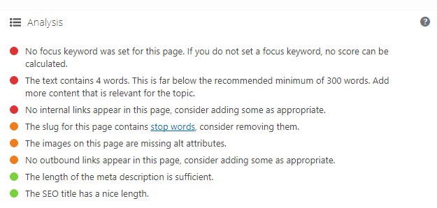
Yoast analysis

There are a couple of visual guides as to how Yoast SEO thinks your efforts are tracking. One is a quick visualised score seen at the top right (in the Publish box, where you publish your blog or save as draft) and this gives you a simple blank (no score), red (poor), amber (OK) or green (good) indicator of how your blog or page is scoring.

The Analysis section, found below the Focus Keyword section, gives you a more detailed view on what is both good and not so good about your blog or page content. This is a handy reminder to see what you may have forgotten to add into your content, such as images, headings or links.

Note that both of these indicators are measured against your Focus Keyword, so without that neither can accurately score your content.

Readability

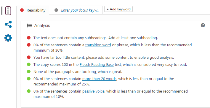
yoast readability

Next to the Focus Keyword tab is the Readability tab. The purpose of this is to look more closely at your content and see what might need changing or adding to generally make your blog easier to read.

This includes using things like headings to break up sections in your blog, and also looks at how much content there is, how easy or difficult your text is to read, and a few other factors.

The blog title itself is usually either a Heading 2 (H2) or a Heading 1 (H1), so when I look to break up my blog posts into sections I tend to use Heading 3 (H3).

The benefit of using the headings, as opposed to using normal text that’s in bold, is that headings tend to naturally stand out more (they are usually bold by default, larger font by default) and also force a line break. This means that any text you write after a heading automatically starts a new line, and the heading itself usually has some padding around it, which in itself makes your text easier to read.

Other Social Media

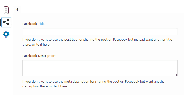
Yoast social

You may be sharing your content on other social platforms, such as Facebook, Twitter, or LinkedIn (among others). However, at times you may want to use a different title, description, or image on those other platforms.

By clicking on the share icon (just next to the Snippet Preview) you can control these things across a number of tabs, meaning you can set a different title to be used in Facebook, a different one again in Twitter, etc. Totally optional, but you do need your Yoast back-end to be connected to the social media platforms to take full advantage of this feature.

Other areas not directly Yoast related

A couple of other areas that, whilst not contained in the Yoast section, are also factors in your SEO performance include the Categories and Tags that you have against your blog post.

It can be confusing as to what the difference is, and to be fair Google treat them identically, but from a “real person wants to come and search your blog” perspective I like to think of Categories as a major topic, and the tags as a sub-topics.

If your blogs were recipes, for example, the Category might be Beef Recipes, or Soups, or something else quite generic. The Tags would then be Beef Lasagne, Shepherd’s Pie, Corned Beef (or Minestrone Soup, foe the Soup category), things that are more specific.

You can have more than one Category and more than one Tag on your blog posts, but while Google treat them the same it’s important to realise you are ultimately writing for people, and having the correct category and tags (and separating the two) can help people find the information on your website.

Note: by default WordPress does not support categories and tags on Pages, only Posts. If you want to have Categories and Tags against Pages also, this can be rectified via a simple plugin. Contact me for details.

Meta Keywords

Way back in prehistoric times as far as websites are concerned (so about 5 years ago. Maybe a little more) you would see sites filled with meta keywords, which were singular words used to describe a site (not to be confused with Meta Description, which contains a summary of what your site, your page, or post is about).

This would often be filled with many synonyms or a vast array of suburb names, city names, however the site wanted to be recognised. You might often have seen these repeated in the footer of someone’s website.

For the record, Meta Keywords are absolutely useless as far as your SEO effort is concerned, and Google now completely ignore them.

This is very much unlike a Meta Description (as described above) which do still hold a lot of relevance and contribute to your overall SEO effort.

Summary

Congratulations if you got this far!

Although this can be thought of as the tip of the SEO-ceberg (<< copyrighted. I’m sure it’ll catch on), getting these fundamentals right can go a long way to getting good results in Google and other search engines.

Remember to:

  • think about your focus keyword and structure your content, title, image tags and so on accordingly
  • use links either internally (eg. to a contact page) or externally (eg. if referencing other sites)
  • break up your content with headings, and / or images, making your content easier on the human eye
  • use categories and tags as appropriate
  • broadcast your blog posts via social media, Facebook, Twitter, LinkedIn, etc to help drive traffic
  • remember that whilst you want to make a good impression for Google and other search engines, ultimately it is people that you are writing for

If you do need further assistance or have questions, you can contact me or post a message below!

Why I use an ad-blocker extension (and will continue to do so)

example speed test without an ad blocker

With the release of the iPhone 6 and 6S, and perhaps more pertinently the release of iOS 9, there has been a lot of talk about the ability for mobile Safari to use ad-blocking technology and effectively do away with what many perceive as the necessity to use an ad-blocker extension in their browser.

Although ad-blocking has been going on for years, when the biggest company in the world decides to let its core users join the ad-blocking fraternity by downloading an app on iPhones and iPads, advertisers, publishers and marketers alike tend to whinge a lot sit up and take notice. Mobile browsing is on the increase, and just as advertising has started making itself more prevalent on mobile devices, Apple has decided enough is enough.

What’s the problem?

As I tend to not use Apple devices (having never owned an iPhone and rarely, if ever, using my iPad to browse the web unless I feel like watching it crash) then these changes are unlikely to affect me in any way, however for a long time I have used ad-blockers in my various browsers for desktop (where I do most of my website browsing), and will continue to do so. Here’s why.

Most advertisements are bullshit. Sorry, you people who are creating annoying advertisements that are attempting to get me to click them, more or less purely for the purpose of generating revenue for someone. They are, for the most part, bullshit.

Roll-overs, pop-overs, pop-unders, auto playing audio ads, roll-pop-the-fuck-off and while you’re at it, show me the way to close you (being that X) that isn’t a game of find-how-to-fucking-close-this-advertisement.

Sedate, mostly unobtrusive, even slightly animated, potentially even displaying something that could interest me that sit mutely in the sidebar of the news page, blog, some other service, I honestly apologise that your good and largely inoffensive work will never be seen my eyes but hey; collateral damage and all that. If it makes you feel any better, before I started using an ad-blocker I more or less desensitised my eyes to you anyway, and almost never clicked on any one of you. OK, so that might not make you feel better.

OK you see some pop-overs. Is that it?

Roll-overs, pop-overs, auto playing audio and similar things aside (although these are annoying enough and easily justify in my mind the use ad-blockers to begin with) it is the increasingly and seemingly persistent methods of advertisers to try and trick you into clicking them that really get me fired up. I’m not talking about scantily clad sexual click-bait here, but the downright sneaky methods advertisers use to try and make “their shit” look like the stuff you’re really trying to look at (ie. the website content).

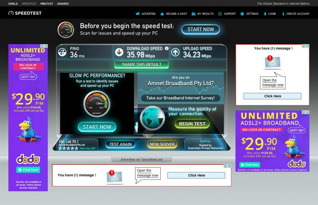
Take the next couple of screenshots for example, from well known ISP / Internet speed testing site speedtest.net:

speed-test-without-ad-blocker-01

The first shot here is when visiting the site (without having run a test as yet). Yes there are some garish Dodo ads here on the left and right banners, but at least they are obviously ads and don’t really intrude on what you are doing. There is also the kind of advertising that has existed throughout the age of the Internet, the old “you have a message! Click here!” type stuff that I would be surprised was very effective these days. Still, easy enough to ignore.

The bit that annoys me? That sneaky “before you begin your speed test” bit that uses the same sort of font as the website, that uses a very similar style of button for its own call-to-action as the original website does. This is trickery. This is trying to make you think that you really should be clicking on this because it looks a lot like the website, and hey it’s trying to ultimately help me (I’d hate to think what would happen if I didn’t click it before I started my speed test. Wouldn’t you?).

It gets worse. If you don’t fall for that trap and continue to perform the speed test, the reason you are on this site to begin with, you see the following:

speed-test-without-ad-blocker-02

Are you kidding me? No less than an additional 5 extra buttons now on screen that all have the same general styling for buttons as the original website, and yet to click on some of them would take you to a completely different website for a completely different purpose. This is advertising trickery.

What about advertising revenue?

The websites might argue that they rely on things such as advertising revenue to continue to provide the services they are providing, but by allowing your advertisers to effectively con people into visiting the website being advertised, you are not only complicit in the advertising trickery, effectively you condone and encourage it.

So having said all that, I can’t but recommend enough using an extension such as uBlock Origin (search for uBlock Origin in Chrome, Firefox, Opera extensions).

Edit: 27 July, 2017
Until recently I was using Adblock Plus, and was reasonably happy with the results. Not long ago though I read how they may have started allowing some advertisers through, for cash. Basically selling themselves out. I wasn’t in favour of that concept, and looked for another blocking tool, and found uBlock Origin.

Here is what I see, after having run the test, on my personal choice of web browser:
speed-test-with-ad-blocker-01

The only buttons I see now are ones that are actually part of the Speed Test page, that don’t redirect me to somewhere I never wanted to be in the first place.

In summary

Speed Test is hardly the only place where this kind of trickery occurs, but I would have to say my web browsing experience is so much better with the ability to block out the annoying bits and pieces. Whether it be news sites, forums, Google searches, Facebook, all of the “noise” is greatly reduced. Plus, a lot of the advertising slows down your browsing, so to me that’s a double win.

Until advertisers sort their shit out, and websites that employ them have a large hand in that, I will continue to use an ad-blocker extension whenever I can.

What do you use?

Mouse scroll wheel not working in File Explorer in Windows 10 resolved

blog feature image

Found a rather annoying issue after upgrading to Windows 10 on my PC in my work office: Basically I found the mouse scroll wheel not working in File Explorer (the Windows 10 replacement to Windows Explorer) using a Microsoft Basic Optical Mouse. Worked fine in other applications, browsers, etc. Frustrating much!

The mouse is connected to a Lenevo desktop machine that is now a few years old. I’ve now finally gotten around to fixing the problem. Here’s how.

Read more Mouse scroll wheel not working in File Explorer in Windows 10 resolved