When it comes to web design trends, square web design is back.
What I, at least partially, put down to the move away from table layouts for design (and thank whomever you like that we have moved away from that horror) we saw rounded corners on everything web related. But there is no doubt in my mind that square web design, or Flat Design, is making a strong return.
Rounded corners everywhere
As well as striving to eradicate table layouts in design (and thereby removing an easy option to have square web designs), other technology advances across the web, such as the Web 2.0 phenomenon and the rise of iPhones and smart phones in general, saw a new wave of rounded corners on every element seen on a web page (or almost every element).
It was no longer cool to have a squared off corner surrounding your menu, content, anything that demanded a border. This is still a strong design element today (not sure iPhones and iPads will sport square icons any time soon), but as I browse around the web (and also classic dev applications) I am seeing more right-angle elements throughout design.
The return of the square in web design
UI kits are springing up spruiking flat designs. Social media icons, where once were horribly overly complex, are coming back to a simpler, cleaner (and sometimes square) design.
Apart from everything old being new again, square web design is being embraced by technology sites such as CSS Tricks and Web Designer Depot (the later having re-designed their site fairly recently), and of course there is Microsoft with their new site (along with a re-vamped Skype site, which oddly has a bit of a mixture of elements going on).
It is not only tech sites that exhibit this trend, clothing brands or warehouse stores such as The Iconic have always had a mostly flat design.
Why the change?
Other significant web sites across a number of industries are embracing a more “square” or flat look. The question is, why?
With a rather underwhelming (and to MS execs, probably quite alarming) uptake of both Windows Phone and Windows 8, with it’s “modern” look which I just can’t seem to get away from calling Metro so people know what I’m talking about, it is not as though the driving force behind flat design has come from the largest software company on the planet. However, you would have to think that Microsoft has had some influence here. Love them or loathe them, people will buy PCs and other devices running Windows 8, so we will see a lot more of the interface that shall not be known as Metro, and by extension, square design.
Maybe another factor behind a resurgence in square web design is one of the driving forces behind rounded everything to begin with; smart phones and other mobile devices.
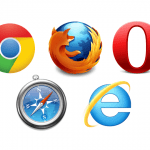
It is a whole lot easier to design with right-angles in mind when trying to ensure that your pixel perfect design will look the same across the vast array of phones, tablets, smaller screen devices. Some mobile browsers do not offer a great deal of support when it comes to rounded corners on div elements, and whilst support for CSS3 across all browsers improves, I think everyone is also just a little tired of putting rounded corners on everything.
Where to from here?
Personally, I like it. At the moment it seems fresh and new and a nice change from the norm. As a budding WordPress theme developer, I am seeing plenty of themes in the marketplace that are also sharing the same sort of square web design paradigm. It also means that when I get around to re-designing my own site theme, square or Flat Design is likely to figure strongly.
Give me another 6 months and I’ll be totally sick of it, of course.